When creating a CSS grid with grid-template-columns you can give your grid lines a name using the square brackets syntax [name]. Child elements can be positioned using this name.
.grid {
  display: grid;
  /* Lines named "firstline", "secondline" and "thirdline" */
  /* Last line has no name */
  grid-template-columns: [firstline] 1fr [secondline] 1fr [thirdline] 1fr;
}

.child {
  /* Use the line name to set the position */
  grid-column: secondline;
}
A line can have multiple names by separating them with a space:
.grid {
  grid-template-columns: [someline] 1fr [somename anothername thirdname] 1fr;
}
And using -start and -end suffixes you can let a line name span over multiple columns. In the example below left spans over the first two columns, center is used for the column in the middle and right spans over the last two columns.
.grid {
  grid-template-columns:
    [left-start] 1fr
    [right-start center] 2fr
    [left-end] 1fr [right-end];
}

.cell-left   { grid-column: left; }   /* 1fr + 2fr */
.cell-center { grid-column: center; } /* 2fr */
.cell-right  { grid-column: right; }  /* 2fr + 1fr */
And here is how this looks like:
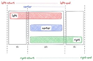
Your child elements don't need to know the exact number of columns anymore and can instead use the line name. And if your grid is responsive and changes the number of columns dynamically, your child elements will still be positioned correctly without an additional media query to update grid-column.